Sustain Africa Summit is a one-day discourse usually staged as a precursor to the heavily renowned yearly Open Source Africa Festival (OSCAFEST), which has been hosted in Lagos since 2021. A group of open-source users, contributors, maintainers, and enthusiasts gather to discuss strategies to further the sustainability of open-source related resources and people.
This year, I was invited to anchor and facilitate a conversation on the sustainability of open-source documentation. I guided participants to dialogue, learn, and share with one another about strategies that could be adopted to make open-source documentation more sustainable, user-friendly, and useful in assisting users in attaining their goals.
Our discussions revolved around these three questions:
- What’s the best piece of documentation you’ve come across?
- What made this piece of documentation particularly pleasant, and how can other documentation adopt these features to improve the user experience?
- What is the worst piece of documentation you have come across? What made the experience terrible? What fixes do you think would make it better?
Best Documentation Examples
Participants mentioned projects like Django, mice DB, Datadog, PostHog, Paystack, and Stripe, as some of the best bodies of documentation they’ve encountered.
Characteristics of good technical documentation
When I asked what made for a good documentation experience, here's a summary of what was mentioned by participants:
-
Docs is structured according to learning or knowledge stage.
-
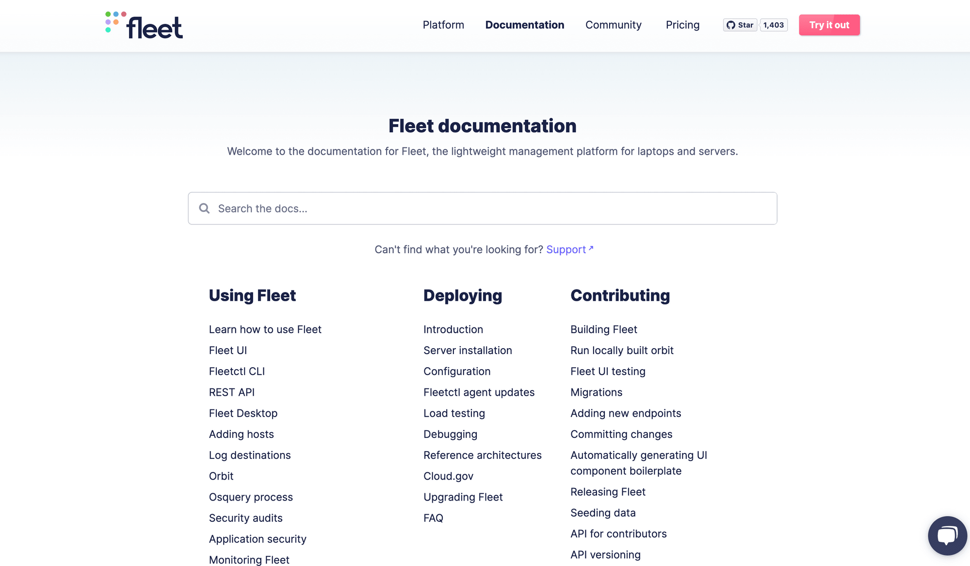
Doc homepage follows a structured format with the following sections:
- What is this product ( answering the questions ‘What, Why, Where, How’)?
- How can this help the reader?
- Where to go for each/different tasks/solutions/problems
This method provides a clear and concise way of how information is oraganised for the reader. It allows them to quickly understand what the documentation is about and how it can help them. Additionally, it provides clear directions for where to go for different tasks, solutions, and problems. For example, see fleet MDM docs homepage:

- Content is written in the second-person voice, directly addressing the reader as 'you', creating a more personal connection between the reader and the text.
- Docs features functional search bar to enable easier findability
- Common errors and roadblocks are documented. For example, the Linux installation guide includes solutions for different problems that people may encounter when installing the operating system.
- Product features a thriving community for support
- The documentation features integration code examples that can be modified and tested out right within the documentation, so one can preview the data/results before and after testing your modifications. The Stripe and Paystack documentation do this quite well.
Characteristics of poor technical documentation
When participants were asked what made for a poor documentation experience, they cited:
- Usage of Jargon, thereby making it not beginner friendly. Jargon can be confusing for beginners who are not familiar with a piece of terminology. To make content more accessible to beginners, it's important to avoid jargon whenever possible. And if you must, it's helpful to provide explanations for any technical terms or acronyms that you do use.
- Documentation is poorly structured or convoluted, making it difficult to navigate and find information. You can find out if your docs are facing this dilemma by conducting a friction test with a newbie user or employee.
- Documentation pages are bulky with so much information, overwhelming the reader and making it difficult to know what to focus on.
- Documentation search experience is broken and does not yield valuable results.
- Documentation does not feature real world examples or code usage.
Tips to improve technical documentation
To round up, I asked participants for additional tips on what could be done to make documentation better for them. Two main points were suggested:
- People who build projects should not be the ones to document it, because of the curse of knowledge. Because, it usually results in docs that are not beginner friendly.
- Differentiate what’s temporary (or dynamic) from permanent (static). Temporary are questions that people keep asking (across social or community platforms like discord). Put those in an FAQ, so people can engage and update what works for them. Use the exact questions people ask as headers, as this makes for better SEO.
Poor Documentation Examples
Participants were also asked to cite some terrible documentation experiences they’ve had. I will not be mentioning any, because I don’t want it to come off as judgemental.
Conclusion
I have shared a recap of this discussion with you, my friends who write documentation, in the hopes that you will learn something new and apply some of these tips from real users to create better documentation for your readers. Selah!

